In the previous post, I explored the simple dataset relating to mortality rates. After running a linear regression model I received some decent results. Depending on one’s goal in a business setting that model might have been good enough. With a decent adjusted R2 value it presented a good starting point.
However, in the interest of leveraging and learning about different machine learning models, I have continued the analysis using clustering and a neural network. This exercise provides many interesting topics that could be posts all to themselves, but for now I stuck to focusing on these two ML methods as they relate specifically to the mortality dataset.
Model Setup: Clustering
The top image in the first post was derived from the clustering graphs generated from this analysis. In addition, the cluster graphs using plotly for JavaScript (check out the code here) also focused on the clusters. They provide a two-dimensional view across the dataset between two variables, but unfortunately, 14 features against one mortality rate result cannot be visualized. That is where the machine learning algorithm results come into play.
Things get a bit more interesting as I run both the clustering and neural network models because I split them up into two parts. The first version analyzes the model against the raw data with the second using a min/max scaler. Separate posts will cover the min/max concept used for part two, but in the meantime, let’s look at the different results that occur.
I will point again to the Python script provided in GitHub on clustering runs and not perform a code-walk here explicitly. Instead, I want to focus on the parts that I purposefully commented out in the script given that they are meant to be ran piece-by-piece in order to compare the two results. This comparison will be the focus both in this clustering discussion and on the following section for the neural network.
Clustering Parts 1 & 2
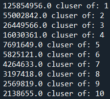
As noted, parts 1 & 2 here refer to the model being run with and without min/max scaling, respectively. After running the non-commented out code in Python the part 1 section allows for more exploration. Specifically, we can run the following code and observe how increasing clusters impact the results on the raw dataset:
p1_clusterNumberPlot =[]
p1_clusterIntertia =[]
for i in range(10):
    i+=1
    z = KMeans(n_clusters=i)
    z.fit_predict(df_part1[['Precipitation','JanuaryF','JulyF','Over65','Household','Education','Housing',
                                'Density','WhiteCollar','LowIncome','HC','NOX','SO2','Humidity','Mortality']])
    print(np.round(z.inertia_,0),"cluser of:",i)
    p1_clusterNumberPlot.append(i)
    p1_clusterIntertia.append(np.round(z.inertia_,0))
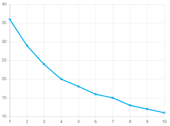
What I’m doing here is creating a model with the number of clusters (n_clusters) equal to the range count in the for loop. The loop starts at 1 and goes to 10, and therefore we obtain results of accuracy (inertia) for 1-10 clusters. From the dataset, it should yield the following result:
More intuitively, I can plot the above findings out to see where the biggest gains start to form. Based on this, it is a little easier to see where to stop in terms of cluster count.
In the above graph, notice how the line bends more sharply down and to the right starting at cluster 3. This “elbow” in the data indicates that accuracy does increase after cluster 3 but more slowly. Visually, this is a quick way to determine how many clusters might be the right choice for the dataset. It is worth noting that another elbow occurs at cluster 5. This is the point at which art meets science, and every analyst will need to leverage both results against a broader dataset, measure if the additional clusters are worth it, and then make a final decision. For my part, I am choosing to be satisfied with three clusters since it is the first noticeable efficiency gain, and, I’m not working with a ton of data here in this post.
With that completed, let’s take a look at what the min/max scaler for part 2 shows against the same graph:
There are a few things to note here. First, the reason the y-axis is so much smaller is because this part uses min/maxing; all data is limited between zero and one. As the accuracy is measured we see error rates significantly lower as a result. Second, the line is much smoother this time due to a more standardized dataset on the backend.
The important thing here is to note the similarity between the two graphs. We do see the same improvement starting at cluster 3 but the “elbow” in the data is more pronounced at cluster 4. This suggests that less efficiency happens after cluster 4 instead of after cluster 3 in the raw data example.
Very cool results! I believe it illustrates well the lift achieved through standardizing data instead of just plugging in what is given. To complete this analysis I would actually choose to go with the four clusters instead of three to better represent the data differences. Further, I am clearly a fan of standardizing data, and therefore the part 2 code for clustering would be the result I’d stick with.
Side Note: The reason I did not even consider clusters 5-10 is due to fears of overfitting the model. We could technically go with 10 clusters and get max efficiency. However, this would lead to a model that is bad at qualifying new data. Such an approach is far too rigid for the goal of machine learning. We need to leave room for the “learning” part to take place and for new information to be assimilated to the models.
Neural Network Parts 1 & 2
In clustering, I broke out the data between the raw dataset (part 1) and the standardized dataset (part 2). The same has been done for the neural network discussed here and for the sake of time I will not repeat the value of doing so. Instead, I will again defer to the Python script to showcase the difference gain between running raw data versus standardized.
Upon running that script, pay attention to the following code from part 1:
df_part1['Accuracy'] = np.where(df_part1['Mortality_cohort']==df_part1['final_Y'],1,0)
mlp_training_accuracy = round(np.sum(df_part1['Accuracy'])/len(df_part1),4)
print('\nInitial Run Accuracy:',mlp_training_accuracy,'\n')
You will get an accuracy output of 0%. The reason for this is because the mortality data in its raw form is wild. Since number differences can range from small to large, predicting something as specific as 75.2 in the actual numbers is highly unlikely. A confusion matrix developed against this dataset would also be large given the many options to choose from across the y-axis available numbers.
This is not to say that running a non-curated neural network in this way is a waste of time or that its result should be immediately dismissed. If the goal is to get close to the mortality rate prediction actuals then this might be the way to go. However, more likely the goal is to get to a number that is more-or-less close to the actual mortality rate, and that is where part 2 comes in. In fact, this finding is why I ended up going through the work of showing two parts to these ML models; I wanted to provide a case for standardizing data, no matter how big or small it is.
In part 2 of the script, I focused on predicting the mortality cohort rather than the mortality rate itself. This made the results much more useable, scalable, and able to be placed into a real production setting. Because mortality is in a statistically derived cohort – and in part 2 I tried to predict that cohort rather than the mortality number – I have a more manageable output. I can now run a confusion matrix to see how I did along with a basic accuracy check.
The following code is used to generate a confusion matrix:
cTrainingMatrix = confusion_matrix(df_part2['Mortality_cohort'],df_part2['Predicted_cohort'])
cTrainingMatrix = pd.DataFrame(cTrainingMatrix)
RunError = round(cTrainingMatrix[0][1]/cTrainingMatrix[1][1],2)
print('--- Confusion Matrix ---','\n')
print('Left Side Actuals; Headers Predictions\n\n',cTrainingMatrix,'\n')
The result from the MLP neural network shows that we did an excellent job at predicting mortality cohorts (note that the left-hand side are the actual values while the top values are the predictions):
| 0 | 1 | 2 | |
| 0 | 40 | 0 | 0 |
| 1 | 4 | 13 | 0 |
| 2 | 0 | 0 | 3 |
Finally, we can near a conclusion to both articles by examining this matrix and certifying that this method is the way to go in predicting mortality rates.
As indicated, the left side 0-2 row names indicate what cohort the mortality rate fell into on the actual data. The heading shows what the neural network predicted from the 14-feature set. For a mortality rate in cohort zero, of which there were 40, my network predicted exactly 40. However, when the mortality rate fell into cohort 1 there were four instances where the network predicted they would be in cohort zero. In fact, when reading the matrix diagonally from top-left, middle, to bottom-right, you can see everything I got right. Any number outside of that is a missed prediction.
With the confusion matrix understood, it says that I got 4 out of (40+13+3+4=60) incorrect; or 7% rounded. Not too bad! By passing the dataset provided through this network I achieved a 93% accuracy rate. Specifically, I can point to the exact data points that failed where cohort 1 was falsely predicted as cohort 0. To the point discussed earlier, we could strive for a better percentage somewhere above 93%, however, we then are likely overfitting the model. In fact, you could argue the model is already entering that territory with such a good result, but on a small dataset like this, I am satisfied with my findings!
Ending Analysis & Summary
This was a fun topic to dig into overall. Using a basic academic dataset I was able to run a linear regression, clustering model and neural network to test out these concepts. I was able to show why the linear model was not strong enough to predict values given the non-linear nature of this data. Through clustering – an unsupervised machine learning method – I can see where the data is alike and different. This led to a choice between three or five cluster counts, of which I chose three in order to protect against overfitting.
Finally, if I were in a production & business setting, it is the neural network that I would publish for ongoing usage. I have a 93% accuracy rate as shown by the confusion matrix. The MLP Classifier in Python’s sklearn library did a great job in controlling the non-linear data and showing that the data points exist to predict mortality rates. We could easily add more data to the model and get accurate predictions from it, unless of course the data begins to change. In that event, the MLP Classifier would pick up upon this, adjust, and likely make a few more errors along the way. This would be just fine because it feeds into the very heart of why we need machine learning: to understand past and present data well enough to make reasonable predictions on the future.
As an ending exercise, in the Python script I can show how to incorporate new data. All new information within the features would need to be set as a Python array; this is how sklearn operates. The following is the syntax required (note that you can pass thousands or millions of data, line-by-line, to Python to predict based on the neural network model):
classifier.predict([[1,2,1,2,2,1,3,2,1,1,1,2,1,3]])From this, you should have received a cohort prediction for mortality of cluster 1. If you observe the characteristics of mortality rates in cohort 1 you will note that the above “new” data in array format is most similar to them. This shows the scalability and ease of use for such machine learning programs and showcases why I love using them so much!
Thank you for reading and I hope this was helpful to kick start some ideas for you!