Climate and demographics impact all life on Earth, even dictating how long we may live. No suite of metrics can give a guaranteed prediction about the end of a life but in the spirit of predictive analysis there’s a lot of value in trying! If we can take a decent set of metrics pertaining to one’s environment, age and how they live it is possible to get an average sense of life-expectancy. Certainly this is interesting and of personal intrigue; with some machine learning techniques and basic metrics I will attempt a foundational layout of how to begin a prediction model.
As a summary into what this post will cover, it follows three machine learning techniques:
- Linear Regression
- Clustering
- Neural Network
There are two parts for each method, one that uses the raw data and another with some standardization interjected. The code is available on GitHub here, and throughout the discussion I focus on Python with sci-kit learn models. These models make a good baseline to follow and allow for scaling both vertically and horizontally in terms of data features and depth of the metrics.
Data Gathering and Sourcing
The dataset being using in this post is taken from an academic source. However, it is a sample and thus only a portion of the full data. It can be found on the Metrics Navigator GitHub here. The data is 60×15 in order to keep the analysis more manageable since the goal is to see the impact of the data features. A dataset like this makes it easier to open up in a tool like Excel to validate findings and follow along easier. The feature set is what I’m interested in here and the results give direction for the next step which would be adding thousands of rows to validate findings.
Before jumping right in I am revealing the features being used in the dataset next in case you don’t feel like opening up the GitHub text file explanation:
- Precipitation: Average annual precipitation in inches
- JanuaryF: Average January temperature in degrees F
- JulyF: Average July temperature in degrees F
- Over65: % of population aged 65 or older
- Household: Average household size
- Education: Median school years completed by those over 22
- Housing: % of housing units which are sound & with all facilities
- Density: Population per sq. mile in urbanized areas
- WhiteCollar: % employed in white collar occupations
- LowIncome: % of families with income < $3000
- HC: Relative hydrocarbon pollution potential
- NOX: Relative nitric oxides pollution potential
- SO2: Relative sulphur dioxide pollution potential
- Humidity: Annual average % relative humidity at 1pm
- Mortality: Total age-adjusted mortality rate per 100,000
With the data in place and descriptions provided we can take a quick look at what we have here before diving into the more complex methods.
Visualization Analysis
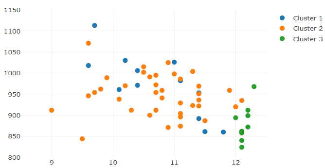
The scatter plot below gives insight into the kind of insights I can draw from the data. In this case, the output of the clustering method shows how mortality rate (our target prediction) compares against precipitation levels:
Interesting in the above example how the clusters are spread apart enough to show distinction between them on this metric. Here is what happens when I compare mortality against education levels:
Again, before diving into all the methods to come, the clustering shows how mortality plays against any metric. Here it seems that clusters 1 and 2 blend together and separation is difficult; cluster 3 is distinct and only mixes with cluster 2 along the mortality (left) axis. As noted before, the totality of dimensions we’re observing here are 14 (when taking out the mortality rate). Thus, looking at a two-dimensional scatter chart just won’t cut it.
Since showing the feature impacts on mortality in 14 dimensions is beyond the realm of physical possibility, I will use the three machine learning methods to figure out the totality of relationships. It won’t result in pretty graphs this time around, but the methods being used here can certainly apply to a business setting and any prediction problem, provided of course the data is cleansed appropriately.
Model Setup: Regression
The model deployed against the data provided is given via GitHub using Python. The first half of the script is showing the setup using sci-kit learn’s ‘linear_model’ library which gives a way to run the regression and use it for production-level predictions on new data:
import sklearn.linear_model


dataImport = pd.read_csv('1. pollution_data.csv')
mortality_df = pd.DataFrame.copy(dataImport)

# convert data to arrays to set up the regression model
X = mortality_df.iloc[:,0:-1].values
Y = mortality_df.iloc[:,-1].values

lin = sklearn.linear_model.LinearRegression()
lin.fit(X,Y)

prediction = lin.predict(X)
FinalPrediction = []
for i in prediction:
    x = round(Decimal(i),0)
    FinalPrediction.append(x)

y_export = pd.DataFrame(FinalPrediction)
y_export.columns=['Prediction']
mortality_df['Prediction'] = y_export['Prediction']
The lin.predict() function derived from the model allows for the passing of any sized ‘X’ array given the features are provided. This example allows for new data to be passed into and out of the prediction model, which in turn can be automated in a production-level setup. Further, any new data provided on top of the base already given in my sample data can be used to test the model and see if the linear relationship is strengthening or weakening.
To that last point, the piece of the model I am briefly digging into here is in:
model = sm.OLS.from_formula('Mortality ~ Precipitation+JanuaryF+JulyF+Over65+Household+Education+Housing+Density+WhiteCollar+LowIncome+HC+NOX+SO2+Humidity',data=mortality_df)
result = model.fit()
print(result.summary())
The following output should have been given from Python:
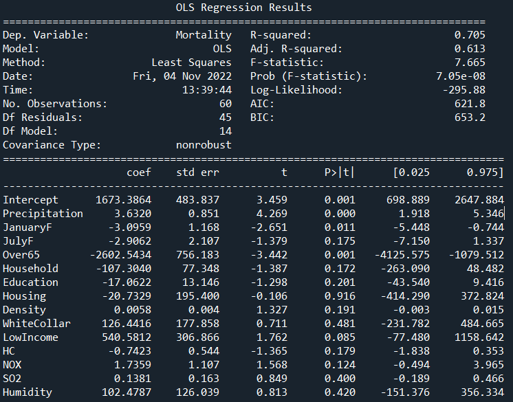
Based on this initial run and corresponding results, I am not too impressed. This isn’t a terrible result to be sure due to an R2 value of 70.5% across all features from the array provided and 61% adjusted. What bothers me are the features that can be somewhat dismissed within the model such as household, education or SO2, among others.
Look through the list at column P>|t| and observe those over 0.05; this is telling us that these features are not contributing significantly to predicting mortality rate. Since they are above our 95% default confidence level, they fail the hypothesis test, and therefore the t-value column to the left does not matter. Looking through this model, there are 11 such features that fit this description, out of a total 14!
Not great, and really not worth the time to think of the original data in a linear sense.
Initial Conclusion
It is always helpful to start with linear models and clustering models in my opinion because it quickly teaches some underlying truth about the data in short time. In this case, the mortality data is not best thought through in linear terms. In the continuation article I walk through the clustering and neural network formulated from this underlying data. It is broken up into two parts for each model: one against the original set and one using the min/max scaler.
If this topic is of interest to you then check out that post next!